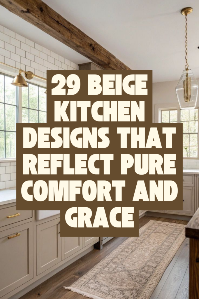
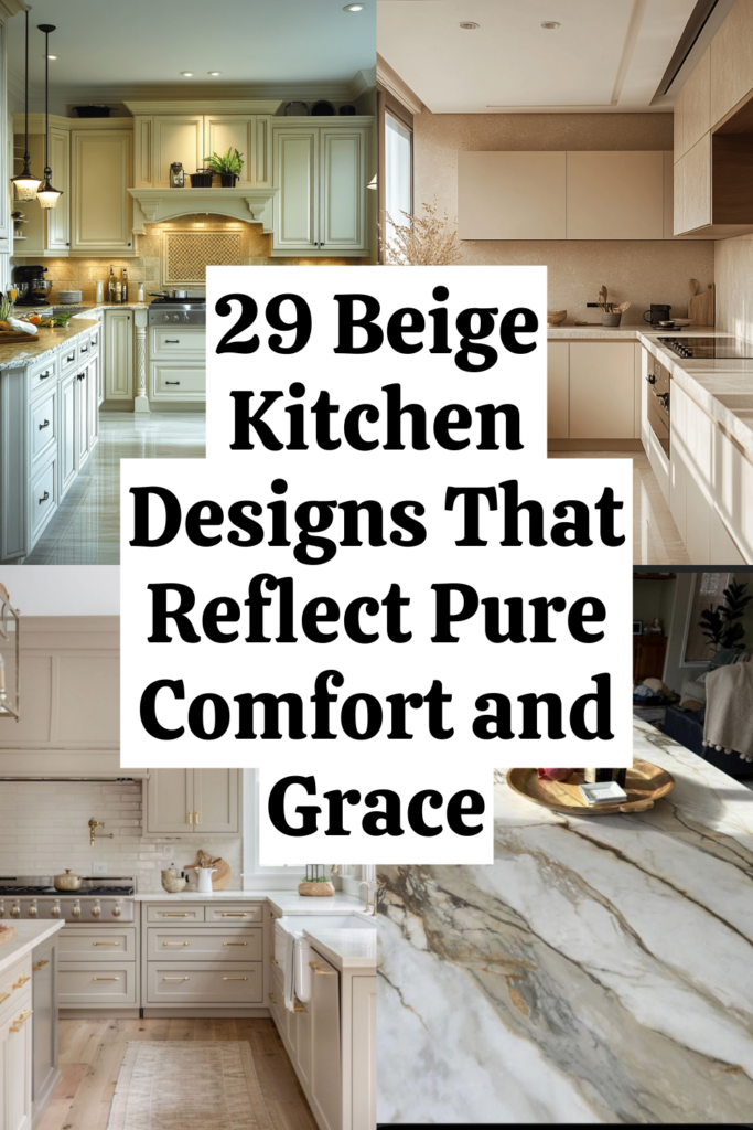
The Beige Kitchen Blueprint — 29 Tricks to Create Warmth, Elegance, and Staying Power
Disclosure : This post may contain affiliate links or paid partnerships. I may earn compensation if you click a link or make a purchase, at no additional cost to you. See my disclosure for more info.
Picture this.
It’s 7 PM. You’re standing at your kitchen counter, rinsing dishes under the world’s most unflattering light. That overhead fixture casts a cold, bluish wash over everything — your countertops, your cabinets, your mood.
The kitchen feels sterile. Flat. Like a waiting room with a stove.
Meanwhile, saved in your phone, there are dozens of kitchens glowing with warm beige light. Kitchens where the stone surfaces seem to radiate heat, where the pendant lights cast soft circles on creamy islands, where everything feels like a slow Sunday morning.
You look at those photos and something tightens in your chest.
Not jealousy exactly. More like longing. A deep, specific craving for a space that feels as warm as it looks.
But you don’t pull the trigger. You don’t start planning. Because the questions pile up faster than the pins.
What shade? What undertone? What if it looks beige in the store and brown on my wall? What if I hate it in six months?
The fear of getting it wrong keeps you standing in a kitchen that already is wrong.
So let’s change that. Right now. With 29 concrete, specific, no-fluff tricks that turn beige from risky to remarkable — starting with the one factor that makes or breaks every single beige kitchen in existence.
First, Fix the Light — Or Nothing Else Matters
Before paint. Before cabinets. Before anything. You need to understand that beige lives and dies by lighting.
The exact same beige looks completely different under different light. Get this wrong and your entire kitchen suffers. Get it right and beige becomes the warmest, most inviting surface you’ve ever lived with.
1. Replace every bulb with warm-toned lighting — 2700K to 3000K.
Cool-toned and daylight bulbs are beige’s worst enemy. They strip the warmth out completely. Your beautiful sand-toned walls suddenly look like concrete.
Warm bulbs between 2700K and 3000K make beige come alive — like late-afternoon sun hitting a limestone wall. Check every fixture. Replace every offender. The transformation is dramatic and immediate.
2. Add LED strips beneath your upper cabinets.
Under-cabinet lighting creates a gentle wash of light across your countertops and backsplash. Shadows soften. Surfaces glow. Your countertop material gets a chance to show its texture.
At night, dim the overheads and let the under-cabinet strips carry the mood. Your kitchen becomes the room everyone gravitates toward.
3. Put every main kitchen light on a dimmer.
Full brightness for slicing vegetables. Soft glow for a glass of wine.
Beige transforms with light intensity. A dimmer gives you the power to control that transformation moment by moment. It’s not a nice-to-have. It’s essential.
Laying the Groundwork: How to Choose Beige Without Regret
Now that you understand how light interacts with beige, you’re ready to choose the right one. This is where most people jump in blindly — and pay for it.
4. Detect the undertone before you pick any swatch.
Every beige carries a hidden undertone. Pink. Yellow. Green. Gray. Each one fundamentally alters the feel of your kitchen.
Hold the sample against crisp white paper. The underlying color reveals itself. Identify the undertone first. The specific shade becomes a much simpler decision after that.
5. Match your beige warmth to your kitchen’s light exposure.
North-facing? Cool, blue-tinted light all day. You need beige that leans warm — golden, honeyed, rich.
South-facing? Warm sunlight handles the heavy lifting. A cooler, grayer beige will still feel inviting.
This is science, not opinion. Ignore it and your carefully chosen swatch will betray you.
6. Observe your paint samples across an entire 48-hour cycle.
Morning. Noon. Night. Three drastically different versions of the same paint.
Slap a generous sample on the wall and live with it. Watch it shift. Let yourself sleep on it. Then decide.
Rushing this step is the most expensive mistake in kitchen design.
7. Assign matte finishes to walls and satin to cabinetry.
Matte on walls creates depth and elegance. It softens light beautifully.
But matte on cabinets you touch constantly? Fingerprint nightmare. Satin finish gives you that soft glow plus easy maintenance. The perfect compromise.
Small Metals, Massive Influence: Getting Fixtures and Hardware Right
With your base locked in, it’s time for the details that seem tiny but carry outsized visual weight.
8. Select unlacquered brass or champagne gold hardware.
Chrome kills the warmth. Matte black can overwhelm delicate beige tones.
Unlacquered brass ages gracefully, developing a rich patina over time. Champagne gold stays consistent and polished. Both complement beige beautifully without competing.
9. Keep faucet and hardware in the same finish family.
Mixing metals is a skill. If you’re not certain you’ve mastered it, play it safe. Same finish across all visible metal — pulls, knobs, faucet.
Consistency reads as intention. Intention reads as luxury.
10. Replace every outlet cover with a wall-matching version.
This takes a minute. Costs nearly nothing.
But those standard white plastic plates against your warm beige walls create visual static. Eliminate them. Your walls will finally look uninterrupted and complete.
Adding Heartbeat: The Finishing Details That Make a Kitchen Feel Alive
Hardware is set. Now add the elements that transform a well-built kitchen into one that makes people feel welcome the instant they walk in.
11. Style your open shelves with handmade ceramics in warm tones.
Not mass-produced matching sets. Handcrafted pieces — slightly irregular, slightly varied in shade, full of character.
Three vessels at staggered heights. A stoneware bowl. A mug with visible maker’s marks. These objects give a kitchen its personality.
12. Bring living green into the room.
One potted olive tree. A windowsill of herbs. Fresh eucalyptus in a vase.
Green against beige is effortlessly beautiful. It introduces life and color without disrupting the soft neutrality of the palette.
Keep it minimal. Keep it breathing.
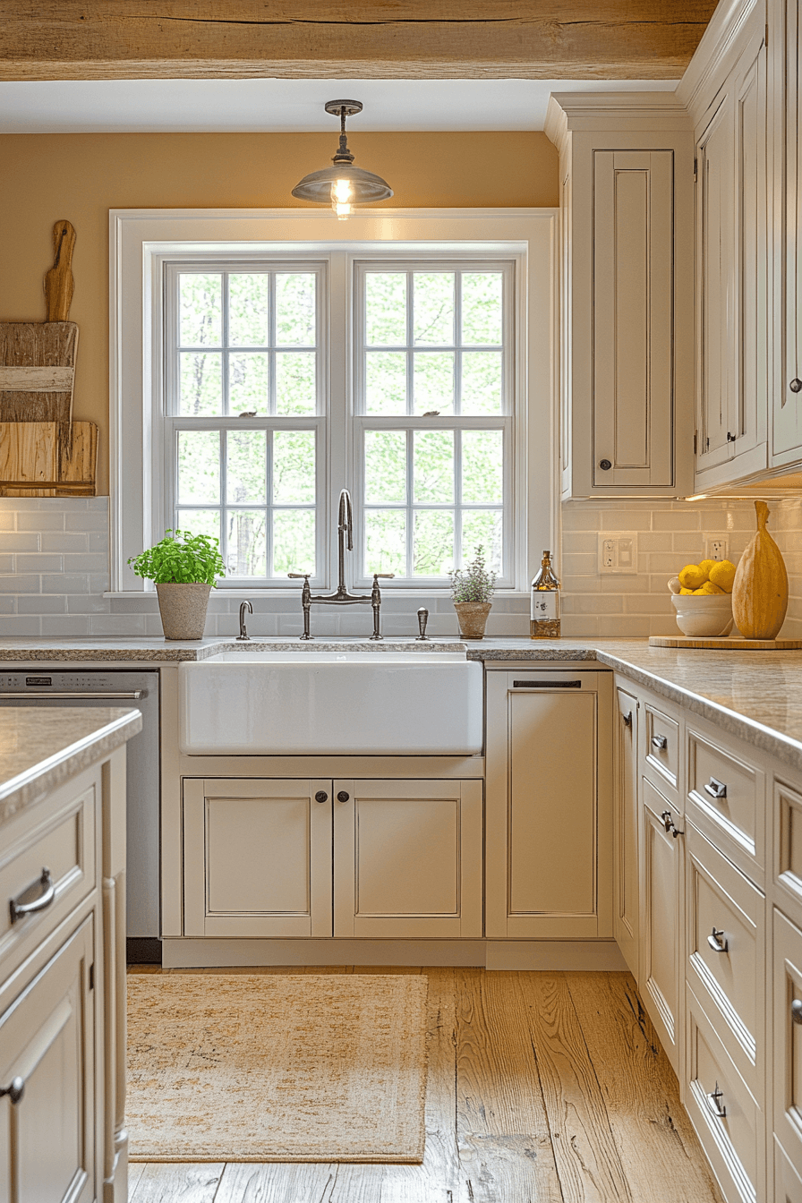
13. Install a composite sink that blends with your countertop.
White porcelain creates too much contrast. Stainless steel clashes with the warmth.
A composite sink in sand, warm stone, or biscuit becomes invisible against your countertop. The surface reads as continuous, unbroken, and completely intentional.
14. Organize displayed items in odd-numbered groupings.
Three. Five. One.
Odd numbers sit more comfortably in the eye than even ones. Use this principle every time you place objects on a counter or shelf.
15. Deconstruct your favorite pins to find the common thread.
Open your boards. Look closely at the kitchens that captured you.
They share something — similar undertones, similar textures, similar measured simplicity. When you identify that shared DNA, you stop guessing and start designing with precision.
Where Hands Meet Surface: Countertop Decisions That Shape the Whole Kitchen
Your countertops anchor the middle zone of your kitchen — they’re where your eyes naturally rest and where your hands spend most of their time.
16. Gravitate toward gentle veining, not bold patterns.
Heavily veined stone battles against the subtlety of beige. It becomes the loudest voice in the room.
You want stone that accompanies the palette — quartz or marble with soft wisps of taupe, cream, or warm gray. Quiet movement. No drama.
17. Bulk your countertop edge up — at minimum two inches.
Thin edges cheapen everything. They undercut the quality of whatever material sits on top.
A thick, weighty edge adds presence and authority. Mitered, waterfall, or simply a chunkier slab — the effect is immediate sophistication.
18. Let the countertop pour down the island sides with a waterfall edge.
The material flowing unbroken from top to floor creates a monolithic, sculptural silhouette. In warm beige or sand, it looks like carved stone plucked from nature.
Dramatic effect. Effortless feel.
19. Link your backsplash visually to the countertop rather than the cabinets.
This counterintuitive move creates a seamless visual plane that makes the kitchen feel more expansive and unified.
When backsplash and countertop read as one surface, the eye relaxes. And a relaxed eye reads luxury.
The Depth Layer: Texture Moves That Save Beige From Boredom
Here’s where ordinary beige kitchens separate from extraordinary ones. Without texture, you have a smooth, uniform box. With it, you have a space that vibrates with warmth and interest.
20. Choose zellige tiles for your backsplash.
Handmade. Slightly irregular. Each tile catches light at a different angle.
In cream or sand, zellige creates a backsplash with living depth — something that shifts and shimmers as the day moves. Mass-produced tiles give you consistency. Zellige gives you magic.
21. Apply plaster texture to your range hood.
Limewash. Venetian plaster. Roman clay.
Cover that metal hood in a hand-applied finish and watch it transform. It catches daylight differently hour by hour. It becomes the room’s most unexpectedly beautiful element.
22. Introduce floating shelves in warm, natural wood.
Honey oak. White oak. Light walnut.
Wood grain provides the organic contrast that keeps an all-beige environment from feeling flat. Two shelves. Your best-looking dishes. A leaning cutting board. Done beautifully.
23. Ground the space with a natural fiber runner.
Jute, sisal, or textured wool at the base of your sink or island.
It softens hard surfaces, adds warmth underfoot, and subtly communicates that this is a kitchen designed for comfort, not just efficiency.
24. Crown the island with a woven pendant light.
One organic fixture. Rattan, wicker, or woven cane.
The shadow patterns it throws across beige surfaces create visual rhythm and movement that polished materials simply can’t. It completes the texture story.
The Structural Backbone: Cabinet Choices That Frame Everything
Finally, the biggest visual element: your cabinets. Everything else exists within the framework they create. Choose wisely.
25. Build around shaker-style profiles.
Not too modern. Not too traditional. Just right.
Shaker doors are clean-lined enough to feel current and detailed enough to feel crafted. They’ve never gone out of style. That’s not an accident.
26. Eliminate the gap — run cabinets to the ceiling.
That awkward empty space above standard cabinets collects dust, dead bugs, and bad energy.
Full-height cabinets create a powerful vertical line. The room feels taller, more intentional, more finished. One decision, disproportionate impact.
27. Play with two beige tones — lighter above, deeper below.
Pale uppers protect airiness. Deeper lowers ground and anchor the space.
The critical constraint: both must live in the same undertone family. Mismatched undertones create subtle visual friction that nags at you without you knowing why.
28. Carve dimension into your island with fluted panels.
Flat island fronts are blank canvases going to waste. Vertical fluting introduces shadow lines, texture, and architectural interest that elevate the island from basic to bespoke.
A small material upgrade with an enormous perceptual payoff.
29. Limit visible hardware to lower cabinets.
Handleless uppers let the eye sweep upward without interruption. The kitchen feels taller, airier, cleaner.
Hardware on lowers provides grip and character exactly where your hands naturally go. Functional minimalism at its finest.
The Kitchen That Makes You Stay
Here’s the honest truth.
The kitchens you keep saving on your phone weren’t built with bottomless budgets. They were built with understanding. Of light. Of undertone. Of texture. Of where to add and where to hold back.
Beige is the warmest, most emotionally generous palette available to you. But it demands attention to the details most people skip. It rewards patience. It punishes haste.
Take these 29 tricks. Work through them deliberately. Not all at once — one by one, with intention.
Build the kitchen that doesn’t just earn a pin from strangers on the internet — but makes you want to pour your coffee a little slower. Linger a little longer. Stay.
Because that’s the real measure of a beautiful kitchen.
Not how it looks on a screen.
How it makes you feel when you’re standing in it.