Your Complete Peach Aesthetic Playbook for a Warmer, More Beautiful Home
Disclosure : This post may contain affiliate links or paid partnerships. I may earn compensation if you click a link or make a purchase, at no additional cost to you. See my disclosure for more info.
Here’s a question.
When was the last time you walked into your living room and actually felt something?
Not just familiarity. Not just routine. An actual emotional response — warmth, calm, beauty — the kind that makes you exhale and think, yes, this is mine.
If you can’t remember, you’re not alone.
Most homes are functional. Clean. Adequate. And completely emotionless.
You know this. You’ve known it for a while.
That’s why you keep saving those images. The sun-drenched rooms. The soft, warm tones. The spaces that look like someone wrapped golden hour inside four walls.
And you keep wondering: why can’t my home feel like that?
It can.
You just need the right steps in the right order. No guessing. No expensive mistakes. No design degree required.
Here’s your complete playbook.
1. Start Here: The Invisible Element That Controls Everything
Let me begin with the factor most people think about last.
Lighting.
This is where peach aesthetics live or die.
You can pick the perfect shade, arrange every piece flawlessly, follow every rule — and still end up with a room that looks flat.
Because peach under cold white fluorescent bulbs turns muddy. Greyish. Like the warmth has been sucked right out.
But peach under warm lighting?
It glows like liquid honey.
Same exact color. Completely different world.
So before anything else, do this:
Replace any cool LED bulbs with warm white — 2700K. Every single one. This changes the entire energy of the room.
Add a table lamp or floor lamp with a warm shade. Overhead light alone creates harshness. Layered light creates atmosphere.
During the day, open your curtains wide. Let real sunlight do the work.
Start with lighting and everything else you do from this point forward gets amplified.
2. The 3 Mistakes That Murder Your Peach Aesthetic Before You Begin
Now that your lighting foundation is set, let’s talk about what to avoid.
Because the fastest way to ruin peach isn’t picking the wrong throw pillow. It’s falling into one of these traps.
Mistake one: peach overload.
Every surface, every textile, every object — all peach.
This doesn’t create warmth. It creates monotony. There’s no contrast. No depth. The eye gets bored instantly.
Peach needs neutral breathing room to actually glow.
Mistake two: ignoring undertones.
One “peach” leans pink. Another “peach” leans orange. Put them together and they look like they’re arguing.
Always compare peach pieces side by side in natural daylight. Not on your phone. Not under store lights. In actual sunlight.
Mistake three: cool-toned pairings.
Icy blue with peach? Electric purple with peach?
No.
Peach wants warm companions — cream, sage green, gold, terracotta, soft wood.
Put it next to a cold aggressive tone and you don’t get sophistication. You get discomfort.
Avoid these three and you’re already far ahead.
3. Why Peach Is the Smartest Color Choice You Can Make Right Now
Let’s talk about why peach specifically.
Because you’ve seen color trends come and go. Millennial pink. Sage everything. Terracotta overload.
Six months in, they all start feeling stale. They date quickly. They box you into a specific style.
Peach doesn’t.
It sits between pink, orange, and cream — a hybrid that refuses to be locked into one aesthetic or one era.
Pantone made “Peach Fuzz” the 2024 Color of the Year. Not for being trendy. For being timelessly warm.
It works with modern furniture. It works with vintage finds. It works in a tiny apartment and a sprawling house.
And here’s what matters for you: peach is incredibly forgiving for beginners. Even basic attempts look polished.
4. Selecting Your Perfect Peach Without the Paint-Store Panic Attack
You’re staring at a wall of paint swatches. Forty-odd shades of “peach.”
Deep breath.
Step one: know your light.
North-facing rooms get cool bluish light. Choose peach with stronger orange undertones so it doesn’t wash out.
South-facing rooms are drenched in warmth. A muted, dusty peach will sing because sunlight will naturally amplify it.
Step two: test big.
Paint a two-foot-wide swatch on your actual wall. Look at it morning, noon, and night. The same shade will show three faces. Love all three or keep looking.
Step three: squint.
Hold the swatch at arm’s length. Squint. Does it still clearly read peach? Or does it dissolve into generic pink or beige?
If it vanishes under a squint, it lacks presence. Pick something bolder.
One afternoon of testing prevents a weekend of repainting.
5. Peach Needs the Right Company — Here Are the Best (and Worst) Pairings
A color is only as good as the company it keeps.
Peach + sage green. The perfect partnership. Sage tempers sweetness. Peach pillows on a sage sofa. Effortless.
Peach + warm white. The safest, most elegant combo. Impossible to ruin. Ideal for the color-nervous.
Peach + terracotta + cream. An earthy tonal trio. Grounded, organic, beautiful in bohemian spaces.
Peach + charcoal grey. Surprising strength. Grey gives peach a modern edge that prevents it from feeling too delicate. Perfect for shared rooms.
Peach + navy. Deep, dramatic contrast. Use sparingly — one blanket, one accent piece. Navy makes peach burn like embers.
The disaster pairing?
Peach + cherry red.
Styled photoshoots make it look cool. In your real home under normal light?
It clashes. Hard.
Don’t go there.
Pick one combo. Commit completely. Consistency is the difference between curated and cluttered.
6. 7 Peach Pieces That Actually Pull Their Weight
Some peach items transform rooms. Others just exist.
Here’s what earns its spot.
One: linen curtains. Sunlight through peach linen equals permanent golden hour. The biggest single transformation you can make.
Two: textured rug. Wool or jute blend. Texture catches light and adds dimension. Flat rugs always look cheap.
Three: velvet pillows. Velvet makes peach shift and shimmer. Two peach, one cream, one warm accent. Sofa done.
Four: ceramic vase cluster. Three vases, three slightly different peach shades. No flowers required. The group reads as intentional.
Five: abstract wall art. No fruit paintings. Abstract warm-toned pieces give peach presence without theme-park energy.
Six: warm metallics. Gold frames, brass holders, warm fixtures. Natural allies to peach. Every time.
Seven: dried florals. Pampas or preserved stems. Months of warmth without maintenance.
Start with a couple. Layer over time.
7. The 60-30-10 Rule That Makes You Look Like a Design Pro
Interior designers have a formula they rarely explain to regular people.
It’s called 60-30-10.
For peach:
60% — Neutral foundation. Walls, big furniture, floors. Warm white, cream, soft beige, light oak. The quiet stage that lets peach perform.
30% — Peach. Curtains, accent chair, pillows, rug. Peach enters as a graceful presence, not a blaring announcement.
10% — Contrast accent. Brushed gold, dark wood, terracotta, sage green. The tiny dose of difference that gives the room its depth.
Without the ratio: random.
With the ratio: professional.
Nobody needs to know where you learned it.
8. The Room-by-Room Blueprint for Peach Done Right
Different rooms play by different rules.
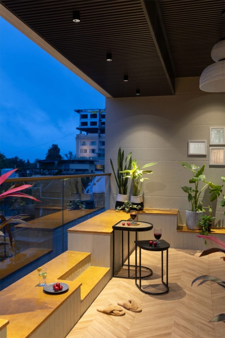
Living room. Your boldest peach space. Large curtains, accent wall, gold details on neutral furniture. Built for lingering. Handles the most peach.
Bedroom. Quiet peach. Duvet, a throw, a candle. The mission is rest. Keep the volume low.
Bathroom. Small bathrooms love peach. Towels, a dispenser, one print. Warmth and the illusion of space.
Kitchen. Restrained peach only. Towels, a bowl, mugs. Too much visual competition already.
Home office. Desk organizer, stationery holder, one print. Warmth without distraction.
9. The Budget-Friendly Peach Upgrade That Doesn’t Require a Contractor
You don’t need to renovate.
You don’t need a designer’s paycheck.
Move one. Three pillows — two peach, one accent. On your current sofa. Instant shift.
Move two. Curtain swap. Peach linen panels. The way light enters a room defines how that room feels. This is the biggest bang for your budget in all of home decor.
Move three. One framed abstract print. Warm tones. Hung where the eye lands naturally.
Move four. A few small accessories — candle, vase, tray — placed with intention.
Four moves. Low cost. High transformation.
The art isn’t buying everything at once. It’s layering thoughtfully, letting each piece build on the last, until the room finally feels like you.
It’s Time to Make Your Home Feel Something
You’ve imagined this long enough.
You have the shades. The ratios. The pairings. The pitfalls. The pieces. The lighting.
Not vague inspiration — a method.
Start small. One corner. One set of pillows. One candle.
Walk past it tomorrow. Coffee in hand. Watch how your eyes are pulled toward the warmth.
Feel how something quiet and golden settles inside your chest.
That’s not decor.
That’s a home that finally shines.
Now go.