07 Green Front Door Colors That Elevate Curb Appeal Instantly
Disclosure : This post may contain affiliate links or paid partnerships. I may earn compensation if you click a link or make a purchase, at no additional cost to you. See my disclosure for more info.
Your front door hasn’t been working for you for a while now.
Could be months. Could be longer.
Each time you approach the house, it registers — not as a welcome, but as something unresolved. The color is dated. Forgettable. It blends into the background when it should be setting the tone.
You’ve spent time looking at ideas. Pinned the beautiful homes. Admired the doors that seem effortlessly right. And still haven’t found the one that translates to your specific house, your specific street.
A front door does more work than most homeowners give it credit for. It’s the first impression, the defining feature of the facade, the signal that tells the world what kind of home this is.
Right now, yours isn’t sending the right signal.
Green is pulling at you. Something with life in it. Something that says considered rather than default. Something that photographs beautifully but also feels right from the inside every single time you come home.
The complexity is that green contains multitudes. The wrong shade — too bright, too washed out, too warm, too cool — can read worse than whatever you have now.
That’s where this guide comes in. You’re about to find the green front door colors that actually work, matched to the homes and situations where each one performs at its highest level.
The Case for Green: Why It Outperforms Almost Every Other Front Door Color
Green’s success as a front door color isn’t a matter of trend — it’s rooted in how the eye processes color.
Of all the colors in the visible spectrum, green sits closest to the center. That means the human eye focuses on it with the least muscular effort. Green is easy to look at because we’re literally built to see it first.
For a front door, that translates to instant visual appeal without visual strain.
But the deeper advantage of green for exterior use is its range of compatibility.
Very few accent colors work well against as many exterior materials as green does. Against warm red brick: striking. Against cool gray stone: composed. Against painted wood: classic. Against white clapboard: memorable.
Bold reds can fight with brick. Blues can feel institutional in the wrong light. Yellows can lose control quickly.
Green adapts without losing its identity.
And on a more human level, green reads as growth and welcome. A green front door doesn’t just look good — it communicates something warm and instinctively inviting to anyone who approaches.
Now for the shades that translate those advantages into actual results on real doors.
1. Sage Green — The Sophisticated Neutral
Sage green occupies a unique position in the green palette — it’s complex enough to be interesting, restrained enough to be refined.
The gray undertones in sage are what do the work. They keep the color from reading as too earthy or too botanical, allowing it to function almost like an elevated neutral — present without being loud.
This shade performs exceptionally alongside warm whites, natural linen, aged wood, and stone. It belongs on homes where the goal is to appear thoughtful rather than showy.
Sage is at its absolute best on warm-toned exteriors. If your brick or stone carries golden, amber, or soft coral notes, sage will bring those tones forward in the most flattering way.
Key consideration: Strong midday sun can wash sage out. If your door faces south and receives several hours of direct light, test a shade or two deeper than your initial instinct. Paint dries slightly lighter than the chip — always.
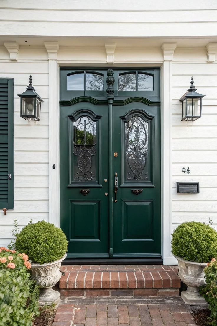
2. Hunter Green — Dark, Rich, and Permanently Relevant
If sage is the elevated neutral, hunter green is the formal anchor.
It has furnished the doors of distinguished homes across multiple centuries and architectural styles. It doesn’t fall out of fashion because it was never truly “in” fashion — it simply exists at a level above trends entirely.
Hunter green reads almost as a warm dark neutral. Darker than navy, warmer than black, richer than most colors that try to occupy the same visual space.
Paired with polished brass hardware, hunter green produces an entryway combination that reads as thoughtfully designed regardless of the budget behind it.
Brass door knocker. Brass kick plate. Brass house numbers.
Commit to brass across every hardware element. The result is cohesive and deeply effective.
Important limitation: Against blue-gray exteriors, hunter green’s warm yellow undertones can generate visual conflict. Cool-toned homes need a different shade — one that’s coming up shortly.
3. Olive Green — Earthy Restraint, Considerable Character
Olive green requires confidence to choose, and rewards that confidence generously.
It lives in the space between green and brown — neither fully one nor the other, and that ambiguity is its strength. Olive reads as rooted, natural, and deeply settled. It doesn’t draw the eye aggressively. It draws it gradually, the way a well-composed room does.
On properties where the natural environment plays a role in the home’s identity — wooded settings, desert landscapes, gardens where the line between cultivated and wild is intentionally blurred — olive green is quietly extraordinary. The door doesn’t interrupt the setting. It completes it.
Dark exteriors are also well-served by olive. Against charcoal, deep brown, or dark slate, olive provides just enough color contrast to register as a deliberate choice rather than a near-miss.
One factor to watch: In shadow or under covered entries, olive can drift toward muted and flat. Always test in the specific lighting conditions your door actually lives in, not under store fluorescents.
4. Emerald Green — Maximum Impact, No Apologies
Emerald green is for the homeowner who has decided that the front door should be the defining feature of the entire exterior. Period.
It’s a jewel tone in every sense — deeply saturated, richly complex, and visually dominant. It does for a front door what a statement piece does for an outfit. Everything else becomes context.
The architecture of your entryway matters here. Emerald demands contrast — specifically, bright white trim — to achieve its full effect. The relationship between white and deep emerald is one of the most powerful visual pairings in residential design.
For hardware, the choice shapes the personality. Matte black handles and hinges push emerald toward sharp contemporary. antique brass pulls it toward storied elegance.
When emerald excels: On doors with genuine panel depth, sidelights, or flanking columns. Architecture gives emerald something to work with. A flat hollow-core door in emerald looks heavy, not luxurious. If that’s your starting point, invest in a paneled door first, then paint it. The improvement going from a flat door to a paneled door in emerald green is genuinely dramatic.
5. Forest Green — Authority Without Drama
Forest green occupies its own distinct space in the green palette.
It’s darker than hunter, less saturated than emerald, and more complex than either. Forest green doesn’t seek attention. It commands it — quietly, the way a well-built home commands attention simply by existing.
This is a color that projects longevity. It says the home was built to endure, has been maintained with intention, and will still be standing and looking correct a generation from now. That’s a powerful subconscious signal.
The ideal pairings for forest green: traditional architecture, white or bone trim, black shutters in dark tones, and a classic paneled door form. The combination produces curb appeal that ages without dating.
And practically speaking — deep greens consistently read as premium and well-maintained to outside observers, including prospective buyers. A forest green door is the kind of detail that influences first impressions at a level most other upgrades can’t match.
When you paint a front door well, you’re not just refreshing paint. You’re reshaping how every visitor reads the entire property.
6. Mint Green — Light, Confident, and Completely Distinctive
Mint is the one that separates homeowners who want to play it safe from homeowners who want to make a genuine impression.
It’s a light, airy green with an unmistakably fresh quality. In the right setting, it’s one of the most charming front door choices available. In the wrong setting, it can read as unserious.
The contexts where mint works best: coastal properties, warm-climate bungalows, homes where character and personality are central to the aesthetic, and mid-century modern designs where lightness and geometry are already in the vocabulary.
For mint to read as elegant rather than cute, the surrounding exterior needs to be simple. White or very pale neutral. Minimal trim detail. No competing accent colors. Give mint the space to be the point of the whole composition.
In the right conditions, it’s a genuinely remarkable choice. The homes that nail it tend to be remembered by everyone who sees them.
7. Eucalyptus Green — The Architect’s Choice
Eucalyptus green has moved from design-world darling to mainstream recognition over the past few years, and the reason is straightforward: it solves a problem nothing else quite solves.
It’s soft enough to feel calm. Cool enough to read as contemporary. Green enough to carry real color without dominating.
For cool-toned exteriors — blue-gray siding, pale stone, white or off-white brick — eucalyptus produces the kind of harmony that takes years of design experience to achieve intentionally. On the right house, it looks like the exterior was designed around the door color.
It works naturally with matte black hardware, concrete planters, and modern house numbers. The overall effect fits precisely within the modern-organic design language that has defined the best residential exteriors of the past decade.
The finishing move: Add potted greenery on either side — real plants, not synthetic — and the eucalyptus door transitions from accent to focal point. The entry feels like part of the landscape. That sense of integration is what takes a well-painted door to a fully resolved exterior.
Before You Commit: The Five Rules That Separate Great Results from Regrets
You’ve identified your shade. Before any paint goes on any surface, here’s what separates the front doors people love from the ones they quietly discuss redoing.
1. Test on the actual door, in your actual light. Screens lie about color — all of them. Get a physical sample, apply it to a large section of the door or a board hung next to it, and observe it over three to five days in morning, midday, and evening light.
2. Audit your fixed elements first. The materials you can’t change — your roof, your masonry, your driveway — are the constraints your green must work within. Know them before you commit.
3. Treat sheen as a design decision. The same color reads differently across finishes. High gloss intensifies color and shows every surface flaw. Satin is the most forgiving and the most universally appropriate for front doors — polish without vulnerability.
4. Include the edges. The door edge is visible whenever the door opens. Paint it the same color as the face. This small step is the single most reliable indicator of whether a paint job looks professional or amateur.
5. Evaluate across seasons. Deep hunter green beside a fall wreath in October is magnificent. Verify it also works with summer planters in midsummer. The best front door colors hold through every month of the year.
You’ve Done the Thinking. Now Make the Move.
Most homeowners spend far too long in the research phase and not nearly enough time in the action phase. You’re past the research now.
You know which shades work and why. You know which ones suit your architecture. You know what to test for before you commit.
The only remaining question is whether you act on it or keep waiting.
Option one: More browsing. More indecision. Another season of a front door that undermines rather than elevates the whole exterior.
Option two: Order the sample for the shade that resonated. Get it on the door. Give yourself the visceral experience of seeing the shift.
The front door is where your home introduces itself. Get that introduction right, and everything else about the exterior reads better because of it.
Fresh. Composed. Worth looking at twice.
That’s what the right green delivers.
You know which one it is. Go get it.