Futon in the Living Room? Here’s How to Make It Look Like a Design Choice
Disclosure : This post may contain affiliate links or paid partnerships. I may earn compensation if you click a link or make a purchase, at no additional cost to you. See my disclosure for more info.
The futon was supposed to be temporary.
Or practical. Or both.
And somewhere between the delivery truck and your living room floor, it went from “smart budget decision” to “why does this look so wrong?”
You’ve done the things people say to do. Rearranged it. Dressed it up with a blanket. Ordered a couple of throw pillows that looked great in the product photo and somehow don’t look great on the actual futon.
Still wrong.
So you start looking at sofas. Real sofas. $800, $1,200, $2,000. You start doing the math and wondering if maybe you just have to bite the bullet and pay up for furniture that looks like it belongs in a grown-up living room.
Put the credit card down.
The futon isn’t the problem. The styling is. And the difference between a futon that looks like a sad leftover and a futon that looks like a considered piece of furniture is not money. It’s method.
Interior architects style with the same furniture you can buy. The same stores. The same futons, honestly.
What they bring is a systematic approach — a way of reading a room and making every element, including a futon, feel like it belongs there completely.
These tips hand you that same approach. Concrete, specific, and actionable right now.
1) Distance the Futon From the Wall
Almost everyone gets this wrong. And it’s the first thing any designer would change.
A futon shoved against the wall looks like it’s waiting for instructions. Like a piece of furniture that hasn’t been assigned a purpose yet.
Designers think of furniture as space-makers. The futon should actively shape the room around it.
Pull it just a few inches away from the wall. That tiny gap creates a shadow line that gives the piece visual depth and makes it feel deliberately positioned. Not placed as an afterthought. Placed with intent.
If there’s an exposed frame involved — wood, metal, pipe — give it visible space. Frames crowded into corners cease to exist. Frames given breathing room become a design feature.
2) Size Up the Rug (You Probably Need a Bigger One)
The rug-too-small problem is everywhere. Walk into almost any un-styled living room and you’ll see it: a futon marooned on bare floor, or perched on a rug that only catches the feet of two of its legs.
Designers have a non-negotiable standard here: the front legs of the futon must sit on the rug. Ideally, the rug extends generously beyond the sides and front of the futon as well.
This accomplishes something critical — it creates a “room within the room.” A seating zone with clear edges that the eye reads as organized, intentional space.
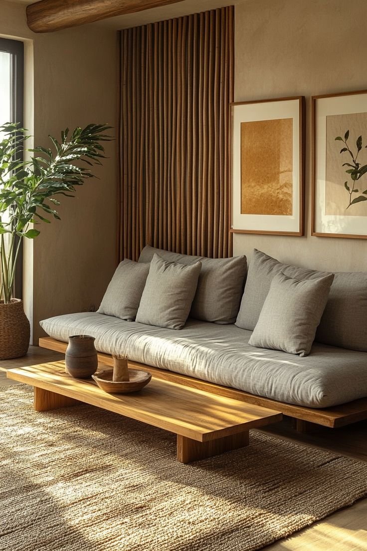
A jute rug works well for a casual, organic look. A flat-weave rug adds surface interest without visual noise.
The rug is not optional. It’s the foundation that every other styling decision sits on top of.
3) The Right Way to Use a Throw Blanket
The draped throw blanket has sabotaged more styling attempts than almost anything else.
Not because throws are bad. Because most people spread them like a fitted sheet over a mattress — straight across, centered, covering as much surface as possible.
That approach fights the futon instead of styling it.
Instead: fold the throw into a long, narrow panel. One-third the width of the futon, folded down lengthwise. Drape it over just one armrest so it hangs down naturally. No centering. Off to one side, deliberately asymmetrical.
Why asymmetry? Because symmetry reads as staged. Asymmetry reads as inhabited. It says someone with taste lives here and doesn’t try too hard.
And match contrasting textures. Futon in smooth fabric? A chunky knit or a linen throw creates the kind of layered depth that makes people stop and look.
4) The Pillow Formula That Actually Works
Pillows are the most overcomplicated element of futon styling. People either use too many or too few, and in both cases the futon ends up looking worse, not better.
Three to five. That’s the number. Odd quantities have an inherent visual ease — it’s a principle that shows up everywhere in design for good reason.
Stack them front to back. Large pillows against the backrest at each end. Medium pillows overlapping slightly in front. One small accent pillow, placed off-center.
Different textures. A velvet pillow beside a loosely woven one. A flat-colored pillow against a low-key pattern. Let the variety do the visual work.
Shape variation is the upgrade most people miss: bring in a lumbar pillow — rectangular — and break up the grid of squares. It signals a curated eye rather than a bulk purchase.
5) The Side Table Is Non-Negotiable
A futon without a side table looks like a living room sentence that ends mid-word. Something essential is clearly absent.
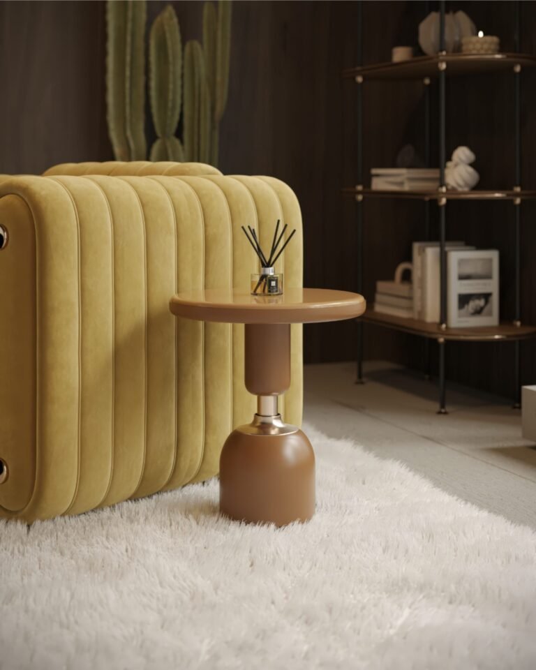
A round side table is a classic choice alongside a straight-edged futon — the contrast of round and rectangular is simple, effective design language. A wooden stool pulls the same duty at a fraction of the price.
Match the height to the armrest. Level with the arm, so the table reads as a natural continuation of the seating rather than furniture that wandered in from another room.
Three things on top: a small lamp, a candle, one other object. Designers call this a vignette. Think of it as a micro-composition — a small, complete scene that anchors the whole seating area.
6) Add a Second Light Source
You can follow every single suggestion in this article. If the lighting is wrong, the room will still fall flat.
Overhead lighting is the great enemy of ambiance. It illuminates evenly and shadowlessly, which erases the texture and depth that make a room feel designed.
A floor lamp beside or behind the futon, fitted with a warm-spectrum bulb around 2700K, immediately changes the character of the space. That amber warmth is unmistakable.
Pair it with a second source elsewhere in the room — a table lamp on a side surface, a low string of warm lights — and you’ve created layered illumination.
Multiple light sources at different heights create shadow, dimension, and atmosphere. It’s one of the fundamental differences between a professionally designed room and a room with furniture in it.
7) The Wall Above the Futon Needs to Do Work
Picture a beautifully framed photograph hung on a blank wall with nothing around it. That’s your futon under a bare wall.
The wall above a seating piece participates in the design. Left empty, it makes the whole setup feel incomplete no matter how well the rest is executed.
One strong piece of art, centered above the futon, hung so the middle of the piece sits at eye level when standing. Not higher — that’s the most common wall-art mistake.
Or a gallery grouping of three to five pieces, varied in size and format, contained within the width of the futon below. Never spilling past the edges of the furniture — designers are strict about this.
Or a large round mirror. It reflects available light, makes the room read as larger, and adds a strong visual anchor without any busy-ness.
One approach. Not a combination of all three.
8) Map Out the Traffic Flow First
Before thinking about what the room looks like, experienced designers think about how it’s used.
If the path from your front door to your kitchen requires squeezing past the futon, the room will feel uncomfortable no matter what it looks like.
Keep at least 18 inches of clear space along the primary circulation path. In tighter rooms, rotating the futon slightly — even 10 or 15 degrees off the wall — can open up the flow significantly and make the room feel noticeably larger.
Furniture that works with the way people move through a room looks like it belongs there. Furniture that fights movement looks like it was placed without thinking.
9) A Tall Plant Is the Fastest Visual Fix
Here’s an observation most people don’t consciously make: living rooms are mostly horizontal. Low sofas, flat tables, wide rugs. All of it sits in a band between the floor and about 30 inches up.
That horizontal monotony needs to be interrupted. Plants do it elegantly.
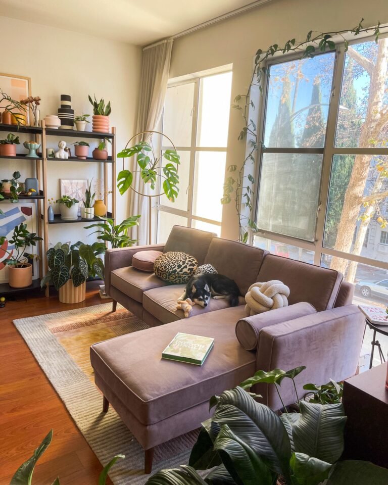
A tall plant — fiddle leaf fig, snake plant, dracaena, monstera — placed beside the futon draws the eye up and adds a vertical accent that wakes up the entire composition.
Position it on the side of the futon that feels more open or bare. The corner where the futon meets the wall is often the perfect spot.
One plant. Not a collection. Contrast, not canopy.
If light is limited, a realistic faux plant gives you all the visual benefit of the height and greenery without the care requirements.
10) Reduce the Color Count
Walk around your living room right now and count the colors. Not counting white walls.
If the number is above four, that’s almost certainly why the room feels unsettled.
Designers build rooms around three colors. Sometimes fewer.
A dominant color — the futon upholstery and rug, which cover the most visual surface area. A supporting color — the cushions and throw, which reinforce without competing. An accent color — one object or piece of art that adds a touch of something unexpected.
The moment a palette is reduced to three controlled colors, the room settles. Things that cost very little start to look considered. The whole space gains a coherence it didn’t have before.
11) Set the Coffee Table at the Right Distance
Most people either push the coffee table right up against the futon or leave it floating somewhere in the middle of the room. Both are wrong.
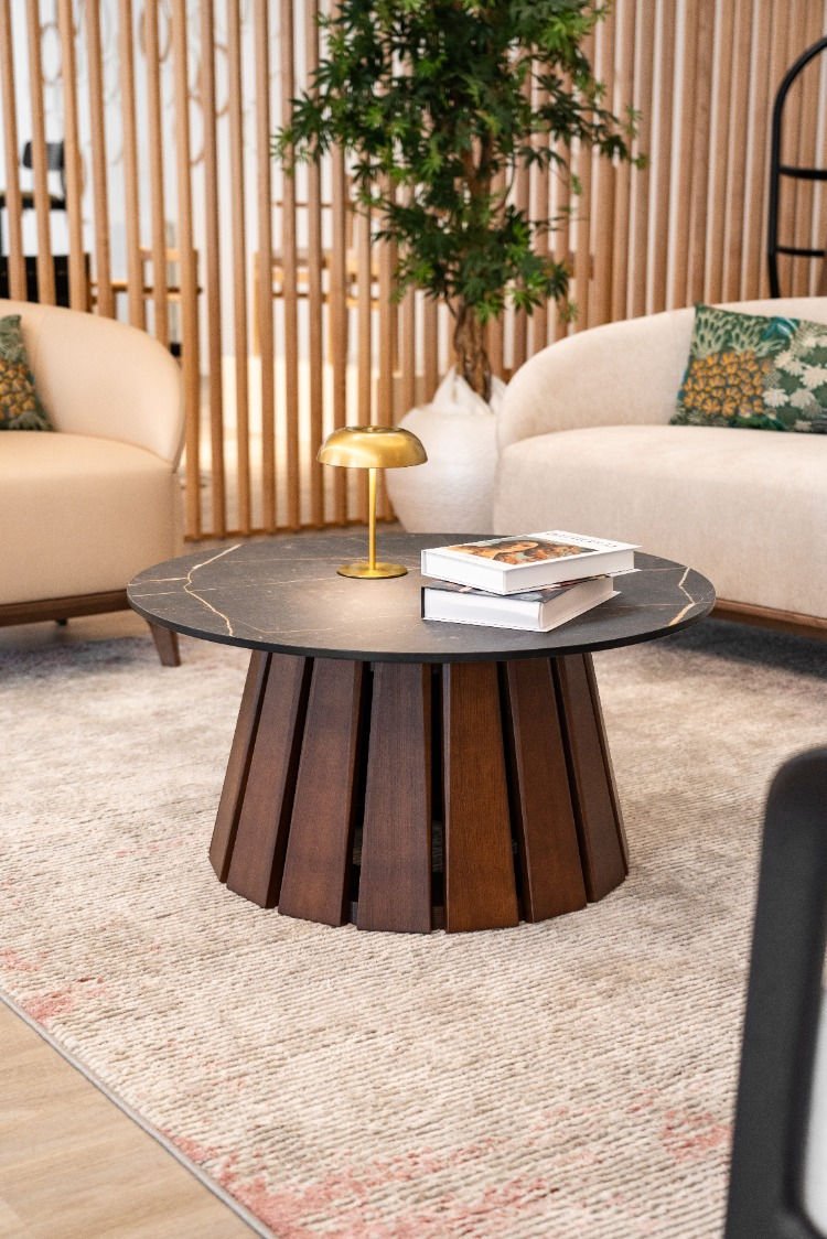
The correct gap between the front edge of the futon seat and the closest edge of the table: fourteen to eighteen inches. Enough to put your feet up comfortably, reach a drink easily, but not so much that the seating area feels like it’s split in two.
A coffee table proportioned to about two-thirds the length of the futon looks balanced. Shorter and it looks mismatched. Longer and it takes over.
Want flexibility? two small nesting tables or a round ottoman with a tray are both excellent alternatives — easy to reposition when the futon needs to unfold.
12) Style for Both Positions — Sofa and Bed
A futon has two lives. Most styling guides only acknowledge one of them.
When you position and style your futon for the sofa configuration, spend two minutes also thinking about what happens when it unfolds.
Is there floor clearance in front? Can the coffee table be moved aside in under a minute? If either answer is no, adjust the room arrangement now before it becomes an inconvenience later.
And keep an attractive basket or bin nearby — one that fits the aesthetic of the room — where pillows and throws can live when the futon converts. The difference between a room that collapses visually the moment a guest arrives and one that handles it gracefully is almost always that basket.
Style both modes. Win both modes.
The Futon Was Never Working Against You
Here’s the plain truth.
There is nothing about a futon that prevents a living room from looking great. Not the form, not the function, not the price point.
What prevents a futon from looking great is treating it like furniture that needs to be apologized for rather than styled with intention.
The principles in this article are the ones designers apply every day — proportion, layering, controlled color, considered light, spatial logic. They apply to futons exactly the same way they apply to a $3,000 sectional.
You don’t need to spend more. You need to apply a method.
Rug. Throw. Pillows. Light. One plant. A clear palette. A plan.
Start with whatever resonates most. One step today. The rest follows.
Your living room is closer to exactly what you want than you think.